picture alliance / Getty Images
Google I/O 2021 is actually happening this year. But due to a certain worldwide pandemic, it will be all online instead of outside in the sun of Mountain View. Google skipped the 2020 edition entirely, but the company is finally ready to deliver its first ever virtual Google I/O. For us onlookers, that means we’re officially entering unknown territory.
Google I/O starts Tuesday, May 18 at 1 pm EDT, when Google/Alphabet CEO Sundar Pichai will take the stage and presumably show off what Google has been working on all year. We’ve been prepping for the show ourselves, and the shift to an all-virtual event hasn’t lessened the amount of tea leaves to read. We’re expecting to see quite a few things over the next week.
Well, first, let’s talk about what we’re probably not going to see: the Pixel 5a. At Google I/O 2019, we saw the launch of the Pixel 3a in May of that year. But with I/O 2020 canceled, the Pixel 4a didn’t hit the market until much later in the following year, on August 20, 2020. Normally we would call the launch timeframe for the 5a a toss up between mirroring the 3a or 4a launch dates, but Google has already set us straight. Back in April, the company said the Pixel 5a would be “announced in line with when last year’s a-series phone was introduced.” So that’s August, not May, and not at Google I/O.
New Android 12 stuff, hopefully including the big redesign
-
Check out these colors! It looks like they are all driven by the wallpaper selection. A beige-colored wallpaper leads to a beige notification panel, widgets, icons, and more.
-
The privacy screen shows kill switches for the camera and microphone. It looks like we’re also getting a new design for the settings page, with big top headers.
-
That green privacy chip in the top-right shows when apps are using the camera, microphone, or location data.
-
New widgets. As the widget screen on the right explains, these show “recent messages, missed calls, and activity status” from a contact.
We’re up to several releases of the Android 12 Developer Preview by now, but Google I/O will mark the release of the first “beta” version. Android 12 definitely has a big redesign coming—we’ve already seen leaks of the new design, and it looks like a significant departure from previous versions. There’s a wild new color-changing UI that shifts to match your wallpaper. All the buttons, sliders, and every other UI widget have been reshaped and rearranged. It has a new scroll list design that, like a Samsung phone, works better on bigger displays by initially starting with a big title and pushing the top of the list content further down the screen, where it can be easily reached. There’s a new privacy UI, which alerts you when your camera, microphone, or location is in use. There’s also a new look for widgets, mirroring iOS’s recent widget revamp.
There is so much “Android redesign” evidence out there we don’t actually know what Android 12 looks like out of the box. We just keep seeing screenshot after screenshot of wildly different UI bits, and having features that change color based on user settings also really doesn’t help when trying to visualize the entire package.
We know all that is coming. The question is, will it be officially unveiled at Google I/O? The previous developer previews have been perfectly fine shipping new functionality while stripping out all the interesting UI changes. Google might want to blast out the new design from the I/O virtual stage, or it might want to save it for closer to launch. One good sign we just recently got was a leak of what looks to be a Material Design sizzle reel from YouTuber Jon Prosser. It’s still not very enlightening as to what Android 12 will look like, but it seems like the kick-off video for unveiling the next version of Material Design.
The Google I/O schedule says at least a few things will be talked about. The new widgets are something that will need developer uptake, so those are getting disclosed at Google I/O during the “Refreshing widgets” talk. The talk promises to show off “useful, discoverable, and beautiful widgets on Android and Assistant.” There’s an interesting curveball at the end there—what do Android homescreen widgets have to do with the Google Assistant?

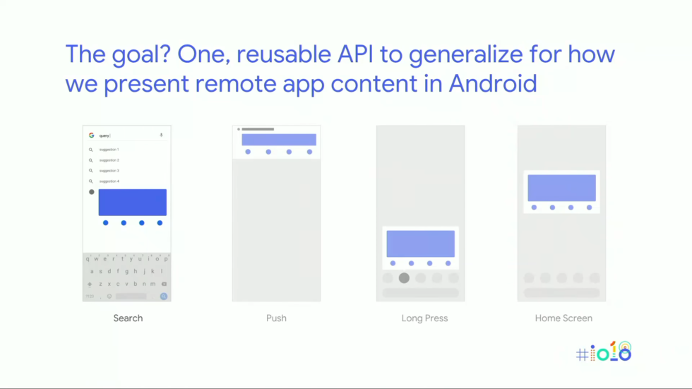
The Slices API is dead, but maybe the new widget API will offer something similar? A single block of code that can display in multiple places?
Sharing code between Android home screen widgets and the Google Assistant is something Google actually started working on before—it was called the “Slices” API. For some reason, though, it never took off. In one of our many interviews with Dave Burke, Android’s head of engineering, we asked him point blank, “Whatever happened to the Slices API?” Displaying remote app content in multiple places sounded like a good idea to us.
“I still think it’s a great idea, but I don’t think we found the fit for it just yet,” Burke said. “We actually built it out, and right now we’re working with the Google Assistant team to see if we can figure out something that makes sense.” The Google Assistant team, you say? That sounds suspiciously like the new widget API. So we’ll be on the lookout for displaying widget content in other, remote places.


